6+ Years Experience
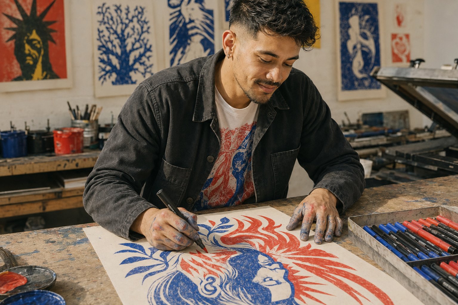
Jake Torres
Graphic DesignerHelping small businesses build memorable brands through professional print and digital design solutions.
- Projects Completed
- 100+
- Retention Rate
- 90%
5
Trusted by over a dozen local startups and restaurants
Northwood Local
About Jake Torres
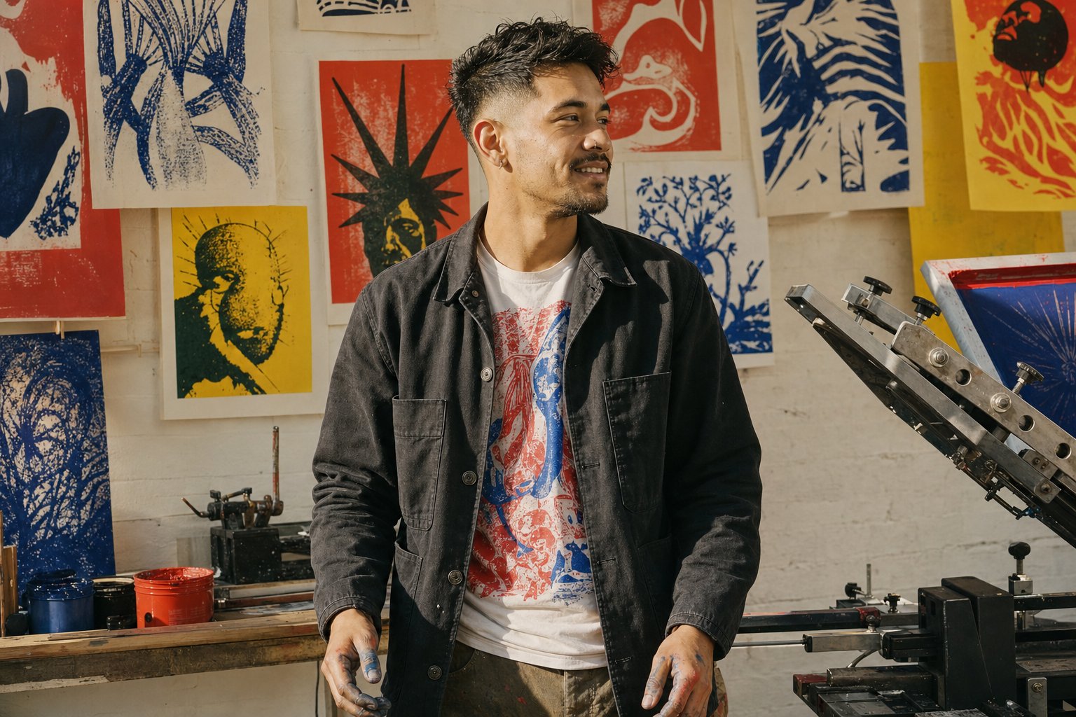
I am a Northwood-based designer helping local startups and service businesses create professional identities that stand out from the competition.
With six years of experience in print and digital media, I focus on clear communication and honest pricing. I enjoy working directly with business owners to solve their unique design challenges.
My approach is grounded in quality craftsmanship and reliability. Whether it's a quick flyer or a full brand refresh, I ensure every detail aligns with your business goals.
- Honest Pricing
Transparent flat rates for projects so you always know exactly what you're paying.
- Fast Turnaround
Efficient workflows designed to meet tight deadlines for urgent print and digital needs.
Selected Projects
A look at how I've helped local businesses establish their visual presence through clean, effective design.
The Corner Bistro
Comprehensive menu redesign and loyalty card system for a local favorite, focusing on readability and brand warmth.
Outcome
Improved customer ordering flow and brand recognition.
PrintBrandingRestaurant
Oakwood Plumbing
Modern logo refresh and full van wrap design to create a professional look for a growing home service business.
Outcome
Increased local visibility and lead generation.
Logo DesignVehicle WrapServices
Maple Creek Festival
Social media templates and promotional flyers for the annual fall community event, ensuring consistent messaging across platforms.
Outcome
Boosted event attendance by 20% via social engagement.
Social MediaEvent MarketingTemplates
How I Can Help
I offer a range of design services tailored to small business budgets. From initial logo concepts to final print preparation, I handle the details so you can focus on running your business.
Logo Design & Refresh
AvailablePopular
Establish a strong first impression with a custom logo that reflects your values. Perfect for new startups or businesses needing a modern update.
- 3 Initial design concepts
- Unlimited revisions for 2 weeks
- High-res vector file formats
- Brand color palette guide
BrandingLogoIdentity
What People Say
Hear from local business owners who trusted me to bring their visual identity to life.
Jake was so easy to work with and really understood the look I was going for. Highly recommend!
SJ
Sarah Johnson
OwnerThe Corner Bistro
Fast, professional, and fair pricing. He got my flyers done in two days. A great local resource.
MM
Mike Miller
FounderMiller Handyman Services
Our new logo looks great. Jake was patient with all my revisions and delivered exactly what he promised.
DO
David Oakwood
ManagerOakwood Plumbing
My Career Journey
A look at the professional experiences that shaped my approach to design and small business branding.
2017 - 2019
Junior Designer at Local Print Shop
Learned the technical side of pre-press production and worked directly with local customers on quick-turnaround print projects.
- Organization
Northwood Print & Copy
- Location
Northwood
PrintTechnical
2019
Launched Freelance Design Studio
Started serving the local community independently, focusing on affordable branding for startups and service businesses.
- Organization
Self-Employed
- Location
Remote / Home Office
Entrepreneurship
2021
100+ Projects Milestone
Successfully completed over 100 design projects for neighborhood businesses, ranging from restaurants to contractors.
- Organization
Jake Torres Design
Growth
2023
Adobe Certified Professional
Achieved official certification in Visual Design, validating advanced skills in Illustrator, Photoshop, and InDesign.
- Organization
Adobe
Certification
Simple, Transparent Pricing
Clear flat rates designed for small business budgets. No hidden fees, just quality design work.
Credit Card, PayPal, Invoice, Bank Transfer
Available Now
Within 24 hoursI respond to all inquiries during business hours.Let's Connect
Ready to start your next design project? Fill out the form below and I'll get back to you within 24 hours.
Project InquiryTell me a little about what you're looking for.
Available for new branding and print projects.
design analysis
Why Active works for Jake Torres
Active sets Jake Torres's display voice in Space Grotesk at its heaviest weight — uppercase, tightly tracked, engineered rather than decorated. Every meta label drops into JetBrains Mono, so the timestamps, section markers, and stat callouts on Jake Torres's page read like instrument readouts instead of captions.
The chrome stays flat: crisp two-pixel edges, zero shadows, zero blur. Color arrives through a palette-tinted canvas that keeps the whole surface humming with quiet electricity, and the accent is spent on pill-shaped CTAs placed exactly where a freelancer actually wants a click. Motion is short — 150 to 250 milliseconds — so the page itself feels quick, which matters when the audience is judging pace.
That velocity framing flatters work in freelance illustration & design: the family reads as performance rather than polish, which suits a practice whose clients care whether things move. For Jake Torres, Active turns the page into evidence of speed — confident without being institutional, energetic without ever bouncing.
cross-reference
See the same content in another family →
Same input, different design direction.
- 01
Atelier
handcrafted, editorial
See it → - 02
Aura
ethereal, glassy
See it → - 03
Authority
formal, structural
See it → - 04
Bento
modular grid
See it → - 05
Cinematic
narrative-driven
See it → - 06
Editorial
magazine-grade
See it → - 07
Kinetic
motion-led, dynamic
See it → - 08
Lab
experimental
See it → - 09
Monolith
industrial minimalist
See it → - 10
Neo-Brutal
raw, aggressive
See it → - 11
Swiss
systematic, typographic
See it → - 12
Trade
pragmatic, services
See it → - 13
Vital
energetic, vibrant
See it →
your turn
Like this? Start your own.
Jake Torres started with a natural-language website brief. The engine confirmed the direction, read the approved public footprint, and rendered the page you just scrolled through.
Generate yours