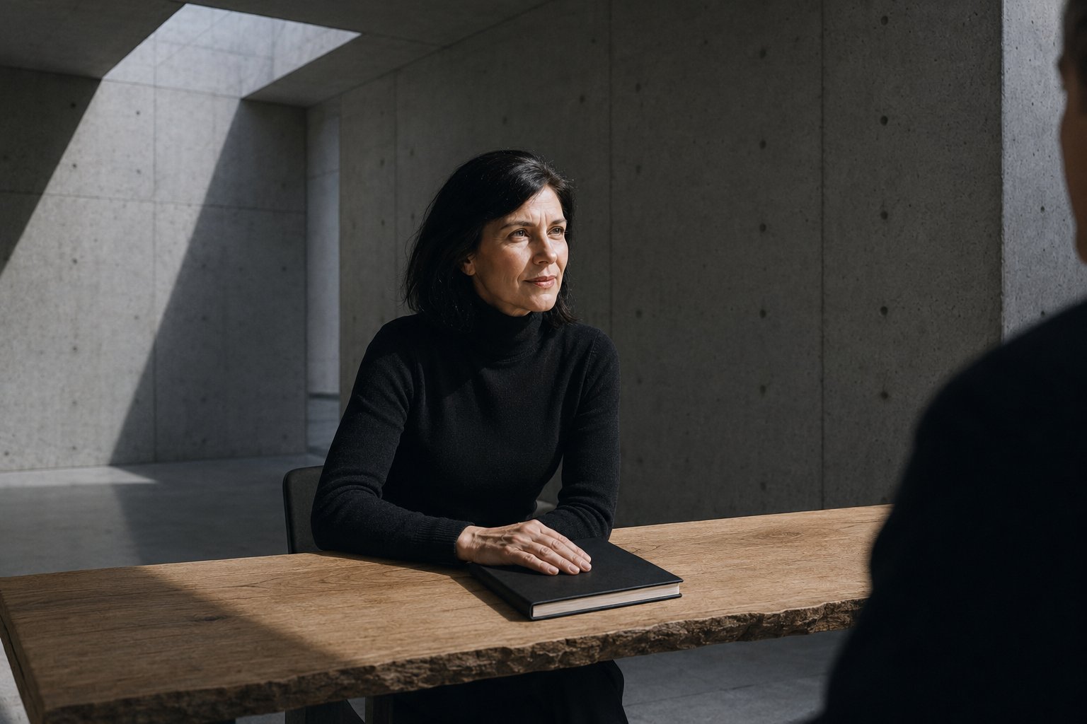
Available for New Clients
Natalie Bergman
Life CoachBalanceGrowthAction
- Clients Supported
- 80+
- Experience
- 6 Years
- Referral Rate
- 90%
4.9
Trusted by over 80 satisfied local clients since 2018
Certified Coach
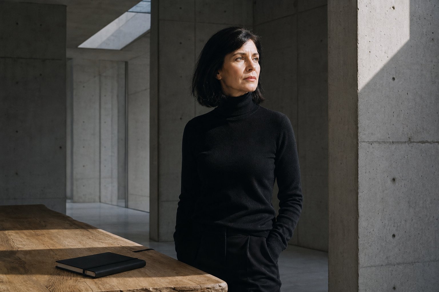
About Natalie
I help busy professionals and parents turn overwhelming transitions into calm, actionable daily habits that actually work.
With six years of experience and a background in HR, I understand the friction between professional demands and personal life. My approach is rooted in empathy and practical, real-world application.
I focus on providing a confidential and supportive environment where we turn abstract goals into a realistic game plan for your career and home life.
- Practical Steps
No-nonsense strategies focused on actionable results for your daily life.
- Flexible Support
Evening appointments available to fit your busy professional or parenting schedule.
Success Stories
Explore how tailored coaching helped clients navigate significant life changes and achieve their professional goals.
Career Path Transition
Guided a client through a three-month process to define a new professional direction, resulting in a successful vocational application.
Outcome
Secured vocational program admission.
CareerPlanning
Parent Time Management
Developed custom scheduling strategies for a new parent to reduce weekly stress and significantly increase quality family time.
Outcome
Reduced weekly stress levels.
RoutineBalance
Confidence & Interviews
Coached a recently laid-off professional on interview skills and self-confidence, leading to a new role within weeks.
Outcome
Successful job placement.
CoachingSkills
How We Can Work Together
My coaching services are designed to provide practical support for your unique situation, focusing on measurable outcomes and sustainable habits that improve your quality of life.
One-on-One Coaching
AvailablePopular
Includes
- Personalized goal setting
- Actionable weekly tasks
- Confidential support environment
- Flexible virtual or in-person
Personalized sessions focused on your specific goals. We tackle your biggest challenges with empathy and a practical, no-nonsense approach to problem-solving.
coachingpersonal
Client Feedback
Hear from individuals who have transformed their routines and careers through our collaborative coaching sessions.
SJ
Sarah Johnson
Working Parent
Natalie helped me see things more clearly. Her practical advice was exactly what I needed.
Local Referral
MC
Michael Chen
Software Engineer
I was feeling overwhelmed, but our weekly sessions helped me get organized and feel back in control.
LinkedIn
JR
Jessica Reed
Marketing Manager
It's like having a cheerleader who also gives you a realistic game plan. Highly recommend!
Facebook
DM
David Miller
Small Business Owner
Fair pricing and very flexible with scheduling. I'm so glad I reached out.
Local Community
My Professional Path
A journey from corporate HR to independent life coaching, driven by a passion for personal development.
2015 - 2018
HR Coordinator
Organization
Local Accounting Firm
Location
Maple Creek
Coordinated employee onboarding and training, sparking a deep interest in professional development and workplace balance.
HRDevelopment
2018
CPC Certification
Organization
iPEC Coaching
Completed professional coach training with iPEC, focusing on core energy coaching and practical goal-setting frameworks.
CertificationTraining
2018 - Present
Life Coaching Practice
Organization
Self-Employed
Location
Remote / Local
Launched an independent practice serving over 80 clients with a focus on career transitions and work-life balance.
EntrepreneurshipCoaching
2023
Workshop Launch
Organization
Community Center
Developed and led a successful community workshop on setting realistic resolutions and sustainable habit building.
Public SpeakingWorkshops
Coaching Packages
Invest in your personal and professional growth with transparent pricing designed for real-world impact.
Credit Card, PayPal, Bank Transfer, Invoice
Common Questions
Find quick answers to questions about the coaching process. If you need more details, feel free to reach out.
FiltersAll
Available Now
Within 24 hoursLet's Connect
Reach out today to discuss your specific goals. You will receive a response within 24 hours to schedule your free introductory consultation and start your journey.
design analysis
Why Aura works for Natalie Bergman
Aura renders Natalie Bergman's page as glass on atmosphere: every surface is layered, backdrop-blurred, and soft-pressed, so elevation reads as light passing through a refractive layer rather than a shadow cast onto paper. Inter carries both display and body through weight shift alone — no serif, no slab — and that discipline is part of the look.
Color comes from beneath the glass. Natalie Bergman's palette tints the atmospheric depth layer while the chrome above it stays luminous, and a single saturated accent is reserved for the one or two moments where a coach needs the visitor to act.
The material quality positions work in executive coaching as premium and forward-looking — the visual lineage runs through visionOS and the marketing surfaces of products that want to feel ten years ahead. For Natalie Bergman, Aura signals seriousness by construction: a page that appears engineered out of light is a hard claim for any competitor to counterfeit.
cross-reference
See the same content in another family →
Same input, different design direction.
- 01
Active
balanced baseline
See it → - 02
Atelier
handcrafted, editorial
See it → - 03
Authority
formal, structural
See it → - 04
Bento
modular grid
See it → - 05
Cinematic
narrative-driven
See it → - 06
Editorial
magazine-grade
See it → - 07
Kinetic
motion-led, dynamic
See it → - 08
Lab
experimental
See it → - 09
Monolith
industrial minimalist
See it → - 10
Neo-Brutal
raw, aggressive
See it → - 11
Swiss
systematic, typographic
See it → - 12
Trade
pragmatic, services
See it → - 13
Vital
energetic, vibrant
See it →
your turn
Like this? Start your own.
Natalie Bergman started with a natural-language website brief. The engine confirmed the direction, read the approved public footprint, and rendered the page you just scrolled through.
Generate yours