Marcus Reid in the Swiss design
Strength & conditioning. A demo site for a strength and conditioning coach.
DemoA demo. The person or business and every detail on the site are made up.
From one name to a whole website
The request this demo started from, and every section GenLP wrote for it.
The requestDemo
For your website, GenLP looks you up first and shows what it found, with sources, before it writes a word.
What GenLP built10 sections on the home page
- HeroMarcus Reid
- AboutAbout Marcus
- ProjectsClient Success
- ServicesTraining & Programs
- TestimonialsClient Feedback
- TimelineMy Journey
- PricingSimple Pricing
- FAQCommon Questions
- ContactLet's Connect
- SocialConnect
Why Swiss works for Marcus Reid
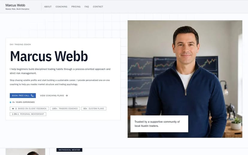
Swiss hands Marcus Reid's page to the grid: system fonts only, gray hairline rules, hard corners everywhere, and headline typography carrying eighty percent of every composition. Elevation comes from weight and size, never from shadow or glow — the interface looks drawn, not rendered.
Because the faces are system-native, Marcus Reid's page ships with zero web-font weight and zero layout shift; the discipline is functional as well as aesthetic. Whitespace is the second material: the grid gives every element a justified position, and anything without one is simply removed.
For a coach in strength & conditioning, this typeset silence reads as rigor. The Müller-Brockmann lineage — museum catalogues, argued-over hairlines — implies a practitioner who sweats the invisible details, and clients generalize from the page to the practice. Marcus Reid gets a site that persuades the way a well-set annual report does: by looking incapable of exaggeration.
Who is the website for?
Free for 14 days. No card. Nothing is public until you say so.